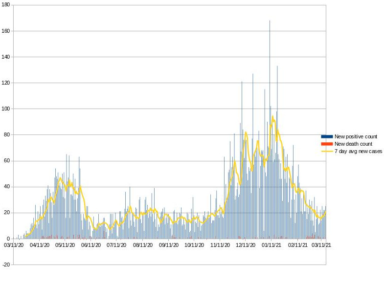
Not unexpected: Alexandria has now provided a full year’s data for this chart. The city’s version lets you hover on any date to see the numbers. This version is just a snapshot.
The bad news is the current direction of that line. Hopefully the upswing is just more noise in the data and will drop down and start to look better.
There are better data sets to look at now, hospitalizations was the second big metric after new cases. Then percent of tests which were positive; the latest (and most optimistic) data set is percent vaccinated. All generally better measures (especially as testing started out very slow) of the situation than this chart of new cases. But this data set now goes back a full year. Hopefully we’ll feel a lot more like pre-Covid before there is a year’s worth of percent positive data, and well before a year of percent vaccinated is interesting.
edit this blog...
HTML hints
Back to the Blog