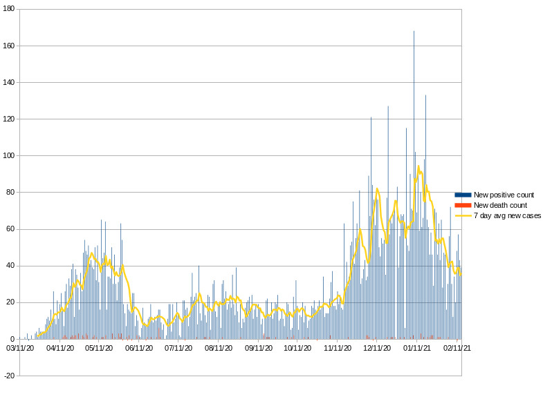
I stopped posting this chart last fall because I kept waiting for that 7 day moving average to drop down and stay down below 10 new cases a day. It kept looking close.
But then the fall wave really hit and it sky rocketed.
Now at least it looks like we’re going back down. But that 10 new cases per day is still a long way away.
I know new positives is not the best measure now, and artificially high compared to a year ago as testing has become much more available.
And it’s great that the vaccine is rolling out; thank you Sarah and the volunteer Alexandria medical corps working the PoDs (place of distribution).
It’s looking better, but seems like we still have a ways to go.
edit this blog...
HTML hints
Back to the Blog